“Iconography has given me the opportunity to undergo a reflection and transformation…”
— Sarah Johnson

"The Holy Trinity" by Sarah Johnson, 14x22in, graphite on paper (2017)
At this point, it is fair to say that all art speaks to tradition; even the most radical work usually sees Dadaism as an ancestor. There was a time when virtually the only way to make a living as an artist was to create religious imagery – the church was one of the only paying customers, and private collectors rarely wanted secular art, except for portraits. Iconography is not always religious, but the use of recurrent symbols and themes in churches arguably laid the foundation of how we think about such things. Sarah Johnson here picks up that tradition in designs that show fealty to the rigid, highly symmetrical compositional formula that were essential in this work, but with a soupcon of individual interpretation in the details of character.
“I have the opinion that art is supposed to reflect to its audience a message,” says Johnson. “I believe art has a very significant role to play in our daily and personal lives as well as having the capacity to influence our entire culture, spiritually and politically. The best examples of that kind of art have one thing in common: it touches the soul. I have a strong desire to share my belief and perspective and Iconography has given me the opportunity to undergo a reflection and transformation and to learn a time-tested medium. I aim to continue in my study in Iconography.”
So Johnson’s images are unabashedly ecclesiastical; a personal expression of spirituality rooted in the long and rich historical traditions employed by some of the greatest artists the world has known: Leonardo, Michelangelo, Raphael, not to mention untold numbers whose specific identity has been lost to time.
Hometown: Maysville, Kentucky
Age: 32
Education: Studied at the Art Academy of Cincinnati
Website: http://www.sarahcatherinejohnson.wordpress.com
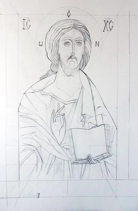
"Christ Pantocrator" by Sarah Johnson, 14x22in, graphite on paper (2017)

"Archangel Michael" by Sarah Johnson, 14x22in, graphite on paper (2017)

"Saint Andrew" by Sarah Johnson, 14x22in, graphite on paper (2017)
Written by Keith Waits. Entire contents copyright © 2017 Louisville Visual Art. All rights reserved.

Are you interested in being on Artebella? Click here to learn more.