
"Callie" by Ann Stewart Anderson, 16x12in, cut paper mosaic (2017)
The Answer Is Sisterhood
It was recently announced that Anderson is one of the recipients of the 2017 Al Smith Fellowship. The prestigious award, named in honor of former arts council chair and Kentucky journalist Al Smith, recognizes professional artists who have reached a high level of achievement in their careers. Since its beginning in 1983, the program has provided more than $2.5 million in funding to artists in the visual arts, literary arts, media arts, composing and choreography. In this round of funding, the fellowships were awarded to artists in the choreography and literary arts disciplines.
Ann Stewart Anderson has been working with assemblage techniques through the use of various media for several years, but most recently she has been using paper, specifically images and textures pulled from art magazines. Now she utilizes the approach in a new series that seems consistent with the style and themes of the Wonderful Old Women (W.O.W.) series, yet there is a new political commentary that has come into play.
“It has been almost a year since I got the idea of creating Sisters,” explains Anderson. “Since then I have made seven TEFFUBUD sisters, three GAMTRA sisters, four NACIREMA sisters, three DEMARF sisters, and I am just now putting the final touches on the last group of as yet unnamed sisters.”
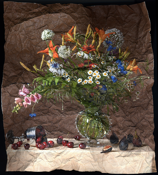
“This new concept pushes me to develop more complex images. The NACIREMA sisters, (Hint: read it backwards), inspired by a portrait of Donald Trump illustrated in last November’s Art In America, is a visual statement about presidential politics. Each woman represents an American state: Minnie, Minnesota; Dela, Delaware; Flora, Florida and Callie, California. All are dressed in black and, hidden away in the composition there are upside down American flags. And, as you can see, all have some characteristics of the face of Trump which literally is under the transforming layers of paper glued over it to create these sisters. I will continue to make more siblings as long as I can find inspiration and material, which is pretty easy thanks to my local bookshop and friends for whom I am delighted to recycle their discarded art magazines.”

"Dela" by Ann Stewart Anderson, 16x12in, cut paper mosaic (2017)
The use of the inverted flag references the U.S. military protocol for flying the flag upside down as a warning to approaching troops. In the past, Anderson, has expressed social commentary through the use of Classical Mythology in her paintings, almost always with a vital feminist undercurrent, yet the political message in these images is expressed with even greater subtlety. Anderson’s use of collage has developed even more, with some of the textures and compositions in “Dela”, for example, recalling her previous work with mosaics.
Anderson ‘s new series is making its public debut in Sisters: A Family Resemblance, a solo show concurrent with the Painting II show at Galerie Hertz, both running through September 2, 2017.
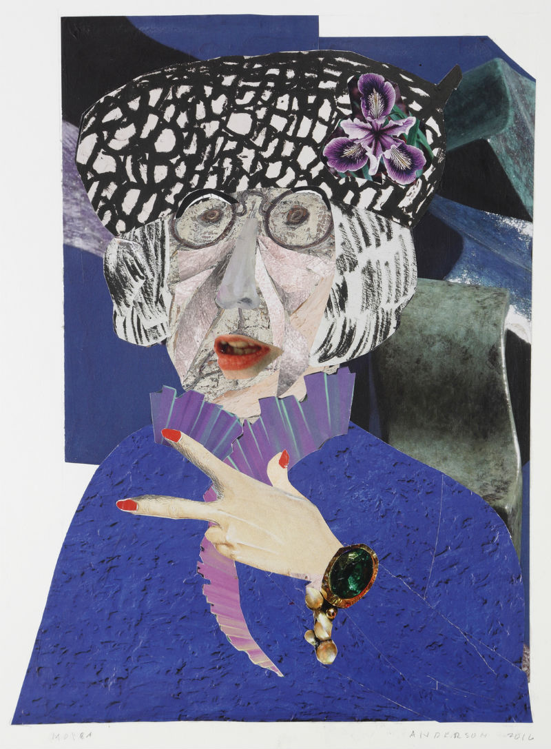
"Moira" by Ann Stewart Anderson, 16x12in, cut paper mosaic (2017)
Anderson’s work can be found in several corporate collections including:
Drake Hotel, Chicago
Turtle Wax Company, Chicago
Hyatt Regency Hotel, Louisville
Brown Foreman Distillers
Atlantic Richfield Corporation
Evansville Museum of Arts and Science
Alabama Power Company
Central Bank, Lexington
Hilliard Lyons, Louisville
Cleveland Clinic
Makers Mark Distillery
Hometown: Louisville, Kentucky
Age: 82
Education: BA, Wellesley College, MA, American University
Gallery Representative: Galerie Hertz (Louisville)
Website: http://www.annstewartanderson.com

"Enid" by Ann Stewart Anderson, 16x12in, cut paper mosaic (2017)
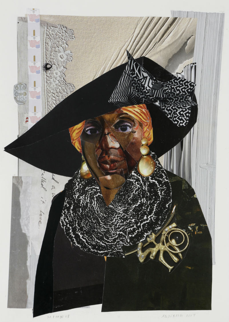
"Minnie" by Ann Stewart Anderson, 16x12in, cut paper mosaic (2017)
Written by Keith Waits. Entire contents copyright © 2017 Louisville Visual Art. All rights reserved.

Are you interested in being on Artebella? Click here to learn more.